Nonprofit web design presents numerous challenges. You need to
- Quickly and concisely communicate what you do without burdening your audience with too much information
- Create a presence that is attractive to potential donors but accessible to those who may be exploring your nonprofit so they can use your services or work with you
- Offer convenience and accessibility to a variety of site visitors
And, most likely, you have to do all of this on a tight budget.
The challenges are real, but they aren’t insurmountable. Advanced web design capabilities such as responsive design are making it easier to optimize across device types. Web platforms built for nonprofits can ensure you get the features you need without paying high prices for functionality that isn’t relevant.
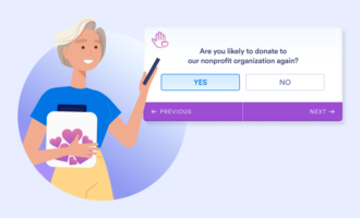
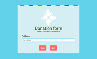
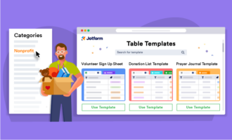
Cloud-based apps like Jotform empower you to create custom forms, surveys, and other engaging, interactive content and host it on your site with ease. Picking and choosing the right solution for your needs is critical, but first, you need a place to start.
It’s often best to begin with inspiration. Think about the best nonprofit websites you’ve seen. How could they help shape your site?
Want some more ideas to consider? Here are five of the top nonprofit websites out there. All of them either won or were nominated for a Webby award, an industry-wide recognition of excellence.
1. #Imagine a School
The #Imagine a School website is a UNICEF Lebanon site that won a Webby for best user experience. The site’s main homepage features a video as the dominant element and initial user experience, drawing site visitors into an immersive environment.
After a short video, the site shifts to an interactive quiz visitors can take to engage deeper with the site and gain a more personal, relatable look at the work being done by the nonprofit. You can skip all of this with a button on the bottom of the screen if you want to jump directly to more specific information.
2. Searching for Syria
Searching for Syria, a UN Refugee Agency site, won a Webby for best use of photography. The site features a wide range of videos, including a large banner image overlaid with statistics and donation details at the top of the site. From there, users can quickly consume more detailed information about the refugee emergency in Syria and access other videos and content to learn more.
3. 11th Macau Design Biennial
Winner of a Webby award for best association website, the 11th Macau Design Biennial site is built around large, abstract images with simplified text above the fold. When you scroll down, the design-focused brand identity that fits the event and its sponsor association remains intact. Essential information is readily available, but the site isn’t cluttered by excessive text, a particularly challenging feat as some elements of the text are intentionally designed to incorporate multiple languages simultaneously.
4. Rotary International
The Rotary International site won a People’s Voice award in the association websites category from the Webby Awards. Some of the key features of the site include a large video-enabled banner at the top of the page, minimalist text, and heavy use of imagery. The design focuses on data and clear opportunities to engage in a variety of content types directly from the homepage.
5. I Saw My City Die
A winner in the Webby category for website best practices, the I Saw My City Die site uses a blend of animated graphics, video, and photography with small snippets of text and data to tell the story of war in urban centers. As you scroll, you move seamlessly between design elements that feature short infographics, quotes, data points, and similar content types. The site tells stories creatively as users scroll, a format that works well, as it’s designed to communicate a special report by the International Committee of the Red Cross.
Common threads and trends for 2024
Looking at these web experiences that make up some of the best nonprofit websites, a few points of similarity stand out as worthwhile to consider when designing your website:
- Using multiple media formats: These sites blend video, animation, photography, text, and custom graphic design work to engage users in diverse ways and tell powerful stories.
- Avoiding text clutter: Open any of these sites, and you’ll almost immediately be greeted by a large banner image with some supplemental text and a navigation header. A single image, video, or animation grabs the spotlight. This isn’t just about design that eliminates clutter and is visually interesting. It also makes it easier to resize the site for different screen types.
- Making essential information accessible: While the banner images or videos are typically used to grab users’ attention, the more functional content, such as donation plugins, contact information, and nuanced stories, don’t require digging to get to. Make sure you identify priority information and make it accessible.
- Leveraging interactivity: Whether through video, quizzes, or intuitive forms, the sites tend to allow for easy and engaging interactions.
You may not have the budget or resources to do everything these industry leaders are accomplishing, but considering the common threads they share can help you stay on top of design trends for the best nonprofit websites and get off to a good start in launching your nonprofit.




























Send Comment:
1 Comments:
More than a year ago
Thanks for sharing your idea this was very helpful to us. I like everything about this site. This is the first time has ever had a website It has greatly improved communications and has given us the ability to make important documents.